munsell::mnsl("5PB 5/10")
#> [1] "#447DBF"This vignette summarises the various formats that grid drawing functions take. Most of this information is available scattered throughout the R documentation. This appendix brings it all together in one place.
Colour and fill
Almost every geom has either colour, fill, or both. Colours and fills can be specified in the following ways:
A name, e.g.,
"red". R has 657 built-in named colours, which can be listed withcolours().-
An rgb specification, with a string of the form
"#RRGGBB"where each of the pairsRR,GG,BBconsists of two hexadecimal digits giving a value in the range00toFFYou can optionally make the colour transparent by using the form
"#RRGGBBAA". An NA, for a completely transparent colour.
-
The munsell package, by Charlotte Wickham, makes it easy to choose specific colours using a system designed by Albert H. Munsell. If you invest a little in learning the system, it provides a convenient way of specifying aesthetically pleasing colours.
Lines
As well as colour, the appearance of a line is affected by linewidth, linetype, linejoin and lineend.
Line type
Line types can be specified with:
-
An integer or name: 0 = blank, 1 = solid, 2 = dashed, 3 = dotted, 4 = dotdash, 5 = longdash, 6 = twodash, as shown below:
lty <- c("solid", "dashed", "dotted", "dotdash", "longdash", "twodash")
linetypes <- data.frame(
  y = seq_along(lty),
  lty = lty
)
ggplot(linetypes, aes(0, y)) +
  geom_segment(aes(xend = 5, yend = y, linetype = lty)) +
  scale_linetype_identity() +
  geom_text(aes(label = lty), hjust = 0, nudge_y = 0.2) +
  scale_x_continuous(NULL, breaks = NULL) +
  scale_y_reverse(NULL, breaks = NULL)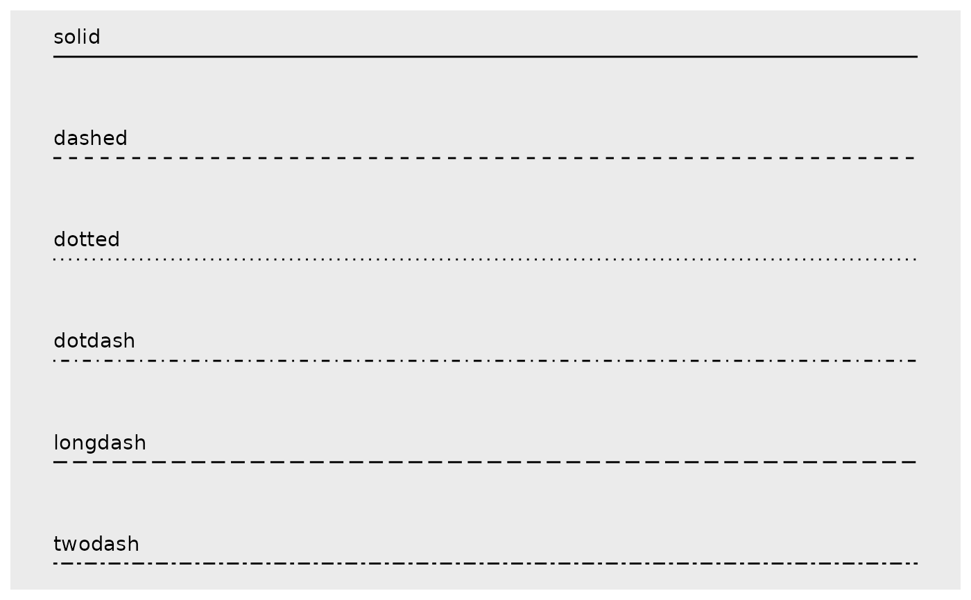
-
The lengths of on/off stretches of line. This is done with a string containing 2, 4, 6, or 8 hexadecimal digits which give the lengths of consecutive lengths. For example, the string
"33"specifies three units on followed by three off and"3313"specifies three units on followed by three off followed by one on and finally three off.lty <- c("11", "18", "1f", "81", "88", "8f", "f1", "f8", "ff") linetypes <- data.frame( y = seq_along(lty), lty = lty ) ggplot(linetypes, aes(0, y)) + geom_segment(aes(xend = 5, yend = y, linetype = lty)) + scale_linetype_identity() + geom_text(aes(label = lty), hjust = 0, nudge_y = 0.2) + scale_x_continuous(NULL, breaks = NULL) + scale_y_reverse(NULL, breaks = NULL)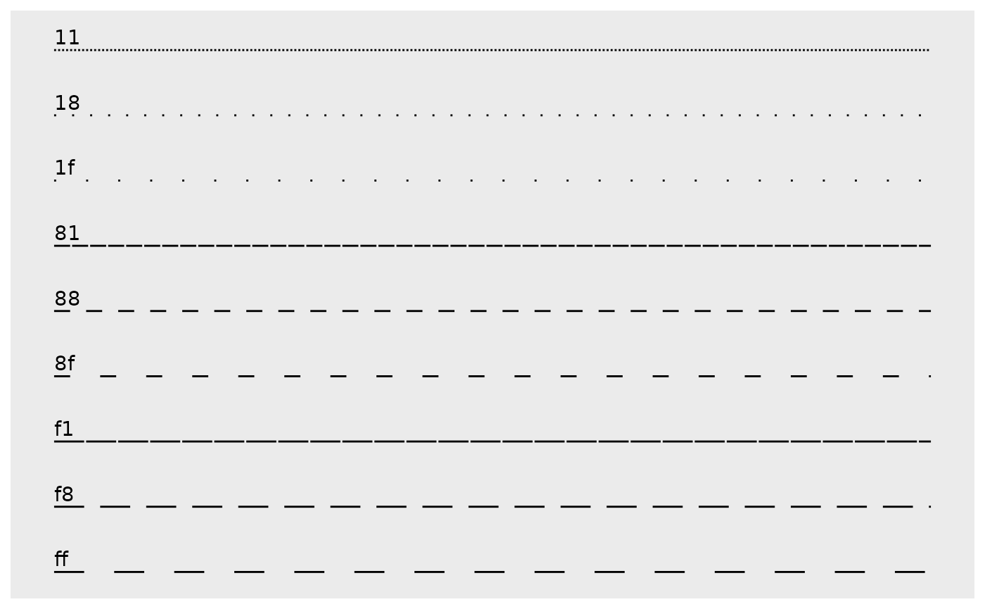
The five standard dash-dot line types described above correspond to 44, 13, 1343, 73, and 2262.
Linewidth
Due to a historical error, the unit of linewidth is roughly 0.75 mm. Making it exactly 1 mm would change a very large number of existing plots, so we’re stuck with this mistake.
Line end/join paramters
-
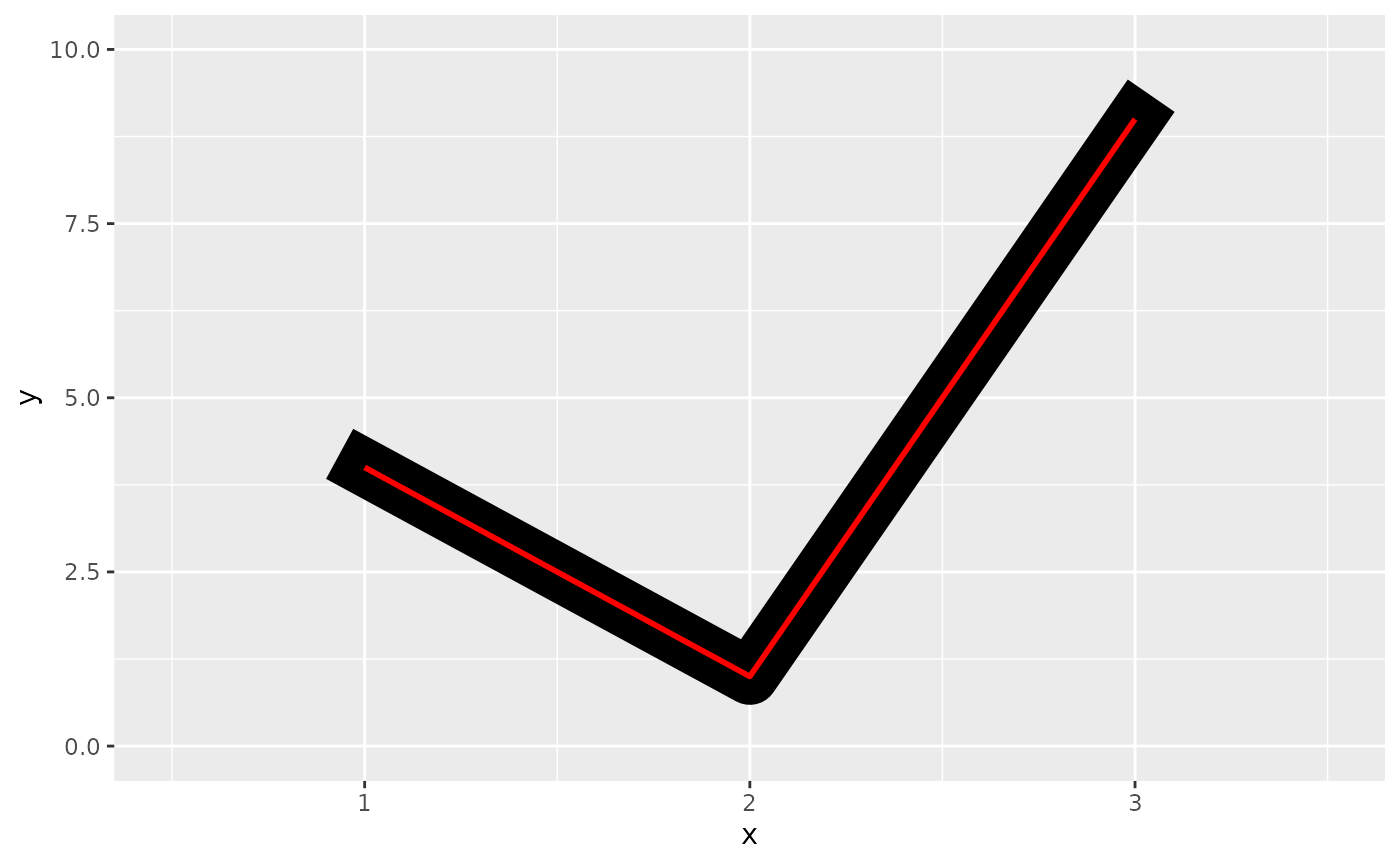
The appearance of the line end is controlled by the
lineendparamter, and can be one of “round”, “butt” (the default), or “square”.df <- data.frame(x = 1:3, y = c(4, 1, 9)) base <- ggplot(df, aes(x, y)) + xlim(0.5, 3.5) + ylim(0, 10) base + geom_path(linewidth = 10) + geom_path(linewidth = 1, colour = "red") base + geom_path(linewidth = 10, lineend = "round") + geom_path(linewidth = 1, colour = "red") base + geom_path(linewidth = 10, lineend = "square") + geom_path(linewidth = 1, colour = "red")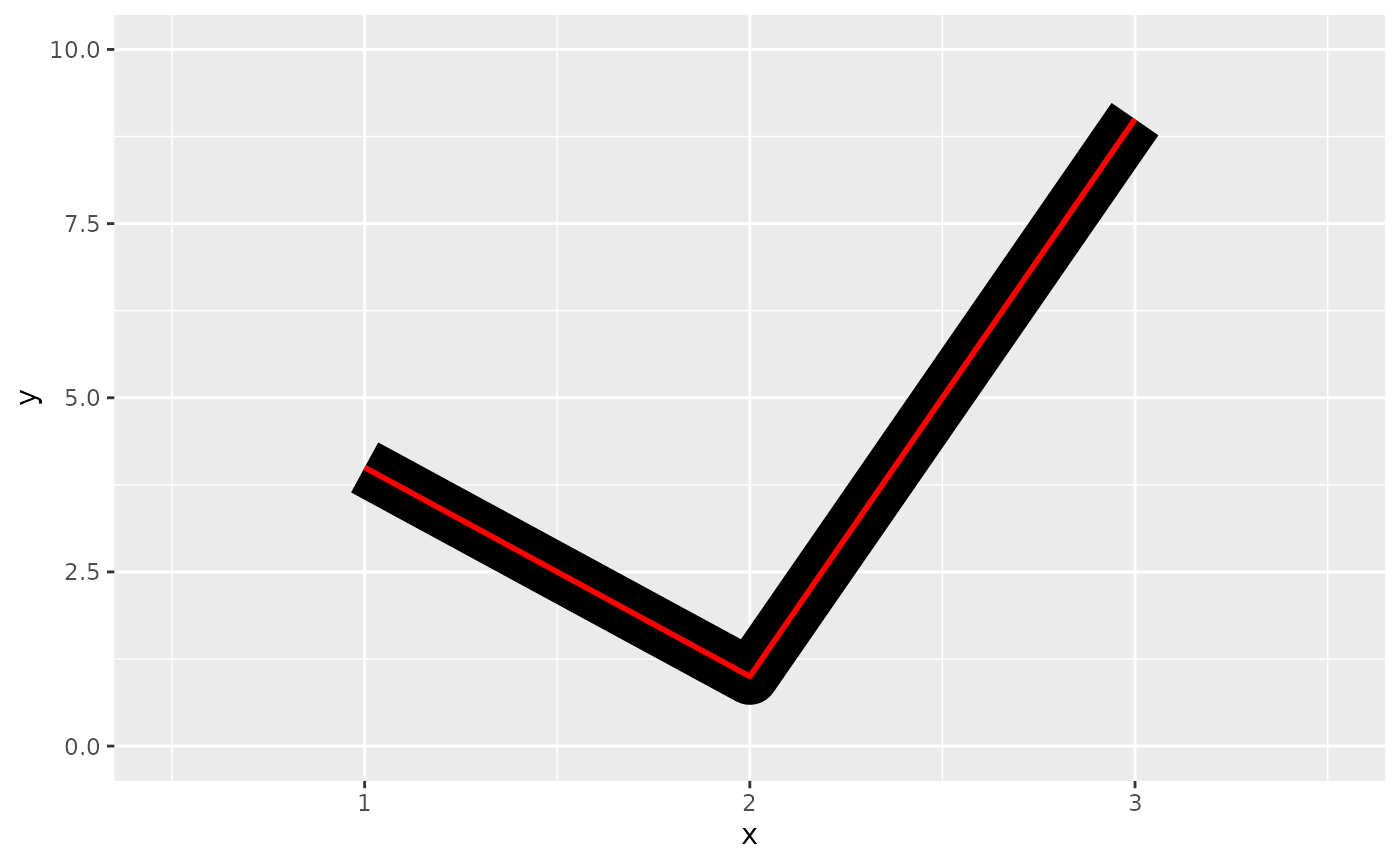
-
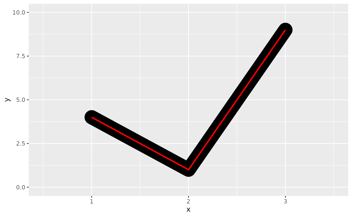
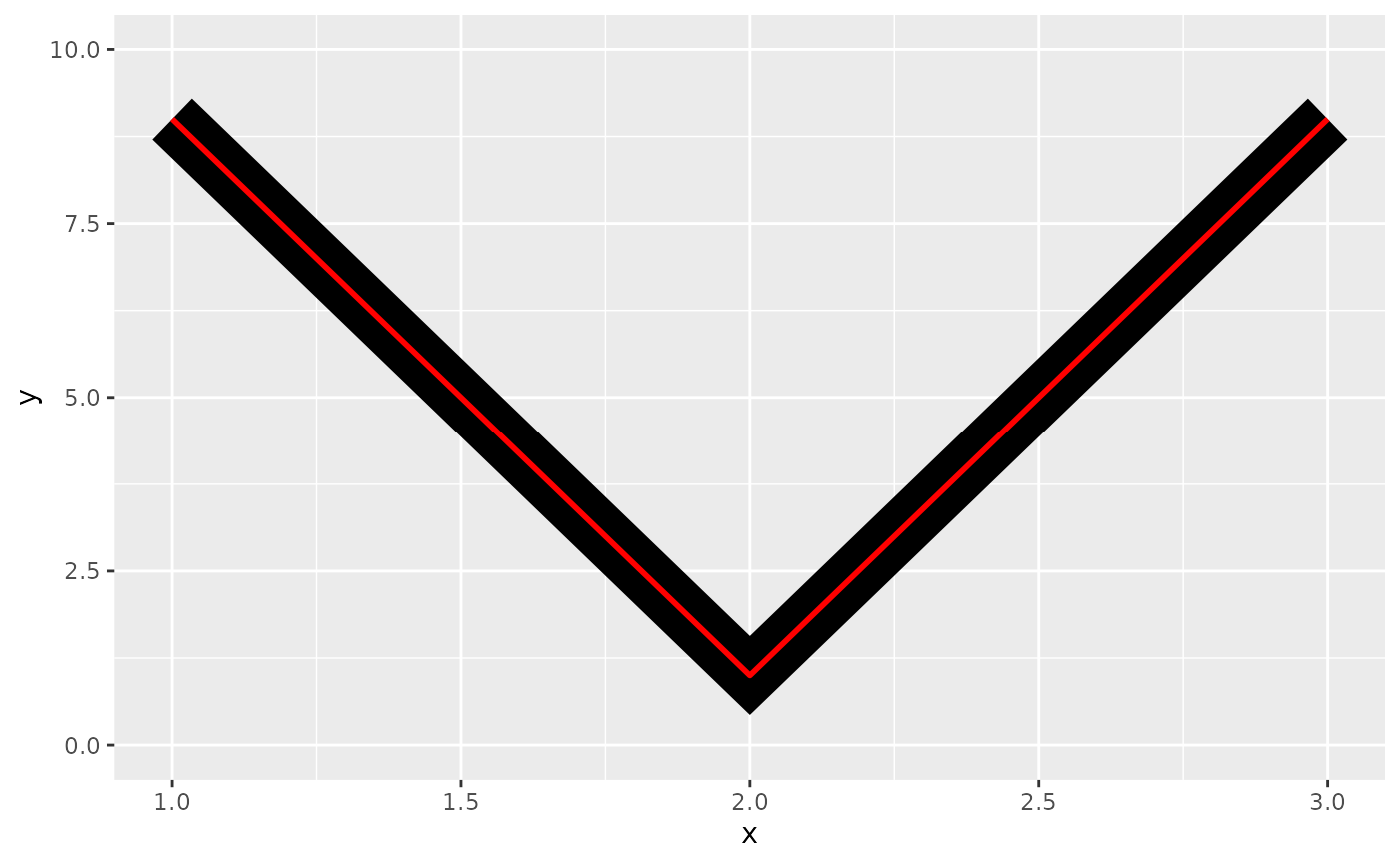
The appearance of line joins is controlled by
linejoinand can be one of “round” (the default), “mitre”, or “bevel”.df <- data.frame(x = 1:3, y = c(9, 1, 9)) base <- ggplot(df, aes(x, y)) + ylim(0, 10) base + geom_path(linewidth = 10) + geom_path(linewidth = 1, colour = "red") base + geom_path(linewidth = 10, linejoin = "mitre") + geom_path(linewidth = 1, colour = "red") base + geom_path(linewidth = 10, linejoin = "bevel") + geom_path(linewidth = 1, colour = "red")
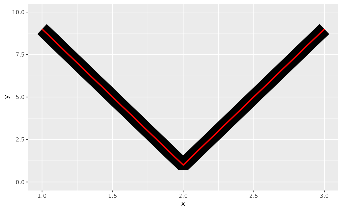
Mitre joins are automatically converted to bevel joins whenever the angle is too small (which would create a very long bevel). This is controlled by the linemitre parameter which specifies the maximum ratio between the line width and the length of the mitre.
Polygons
The border of the polygon is controlled by the colour, linetype, and linewidth aesthetics as described above. The inside is controlled by fill.
Point
Shape
Shapes take five types of values:
-
An integer in :
shapes <- data.frame(
  shape = c(0:19, 22, 21, 24, 23, 20),
  x = 0:24 %/% 5,
  y = -(0:24 %% 5)
)
ggplot(shapes, aes(x, y)) +
  geom_point(aes(shape = shape), size = 5, fill = "red") +
  geom_text(aes(label = shape), hjust = 0, nudge_x = 0.15) +
  scale_shape_identity() +
  expand_limits(x = 4.1) +
  theme_void()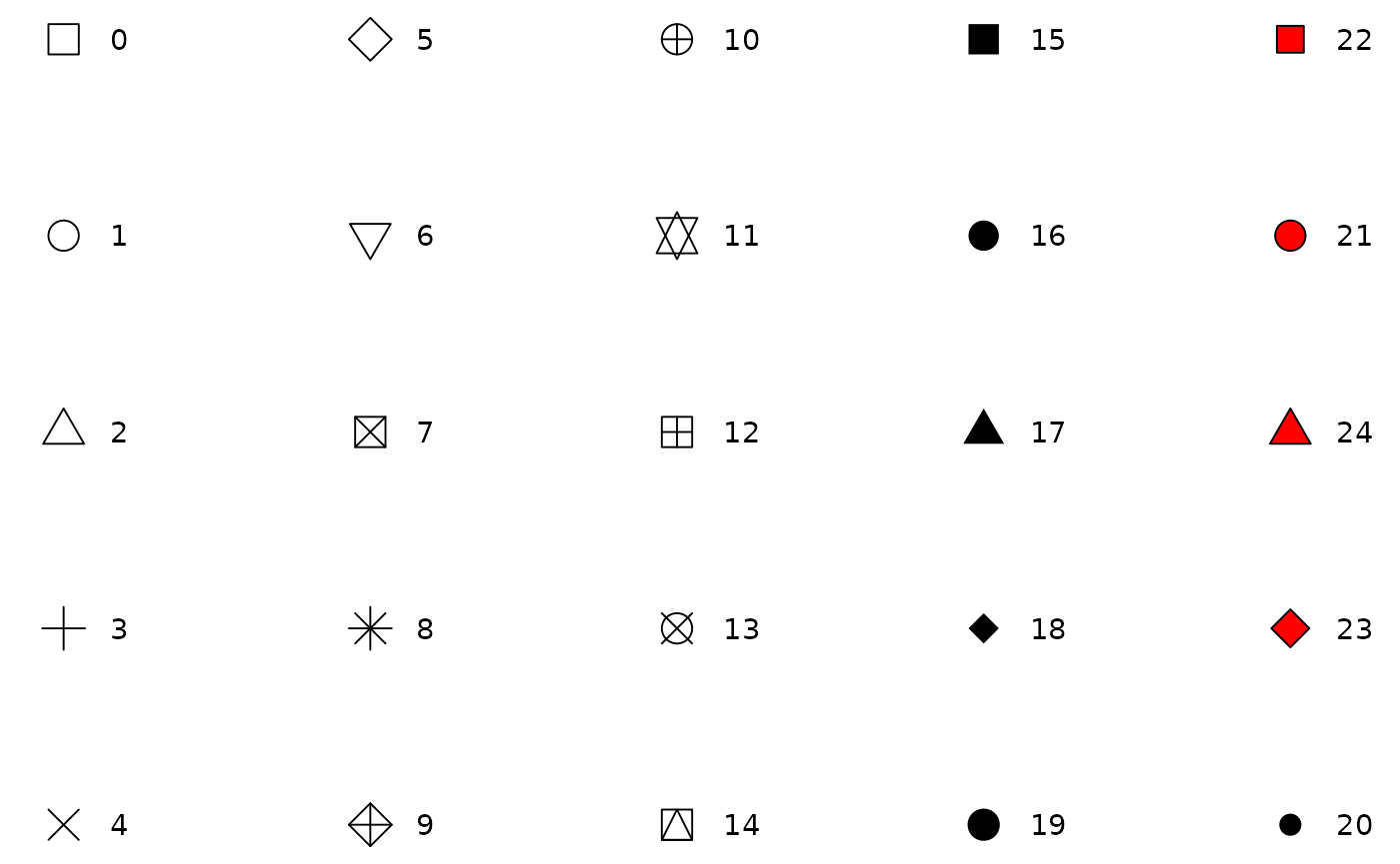
-
The name of the shape:
shape_names <- c(
  "circle", paste("circle", c("open", "filled", "cross", "plus", "small")), "bullet",
  "square", paste("square", c("open", "filled", "cross", "plus", "triangle")),
  "diamond", paste("diamond", c("open", "filled", "plus")),
  "triangle", paste("triangle", c("open", "filled", "square")),
  paste("triangle down", c("open", "filled")),
  "plus", "cross", "asterisk"
)

shapes <- data.frame(
  shape_names = shape_names,
  x = c(1:7, 1:6, 1:3, 5, 1:3, 6, 2:3, 1:3),
  y = -rep(1:6, c(7, 6, 4, 4, 2, 3))
)

ggplot(shapes, aes(x, y)) +
  geom_point(aes(shape = shape_names), fill = "red", size = 5) +
  geom_text(aes(label = shape_names), nudge_y = -0.3, size = 3.5) +
  scale_shape_identity() +
  theme_void()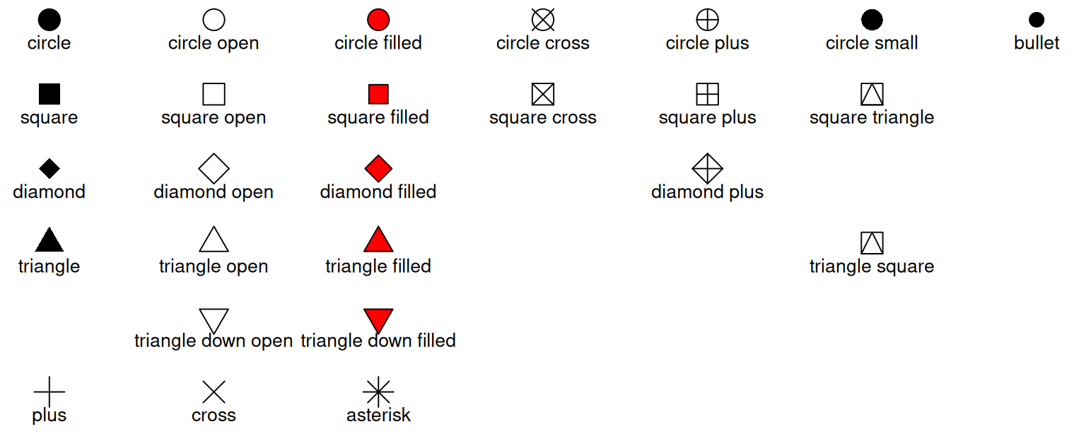
A single character, to use that character as a plotting symbol.
A
.to draw the smallest rectangle that is visible, usually 1 pixel.An
NA, to draw nothing.
Colour and fill
While colour applies to all shapes, fill only applies to shapes 21-25, as can be seen above. The size of the filled part is controlled by size, the size of the stroke is controlled by stroke. Each is measured in mm, and the total size of the point is the sum of the two. Note that the size is constant along the diagonal in the following figure.
sizes <- expand.grid(size = (0:3) * 2, stroke = (0:3) * 2)
ggplot(sizes, aes(size, stroke, size = size, stroke = stroke)) +
  geom_abline(slope = -1, intercept = 6, colour = "white", linewidth = 6) +
  geom_point(shape = 21, fill = "red") +
  scale_size_identity()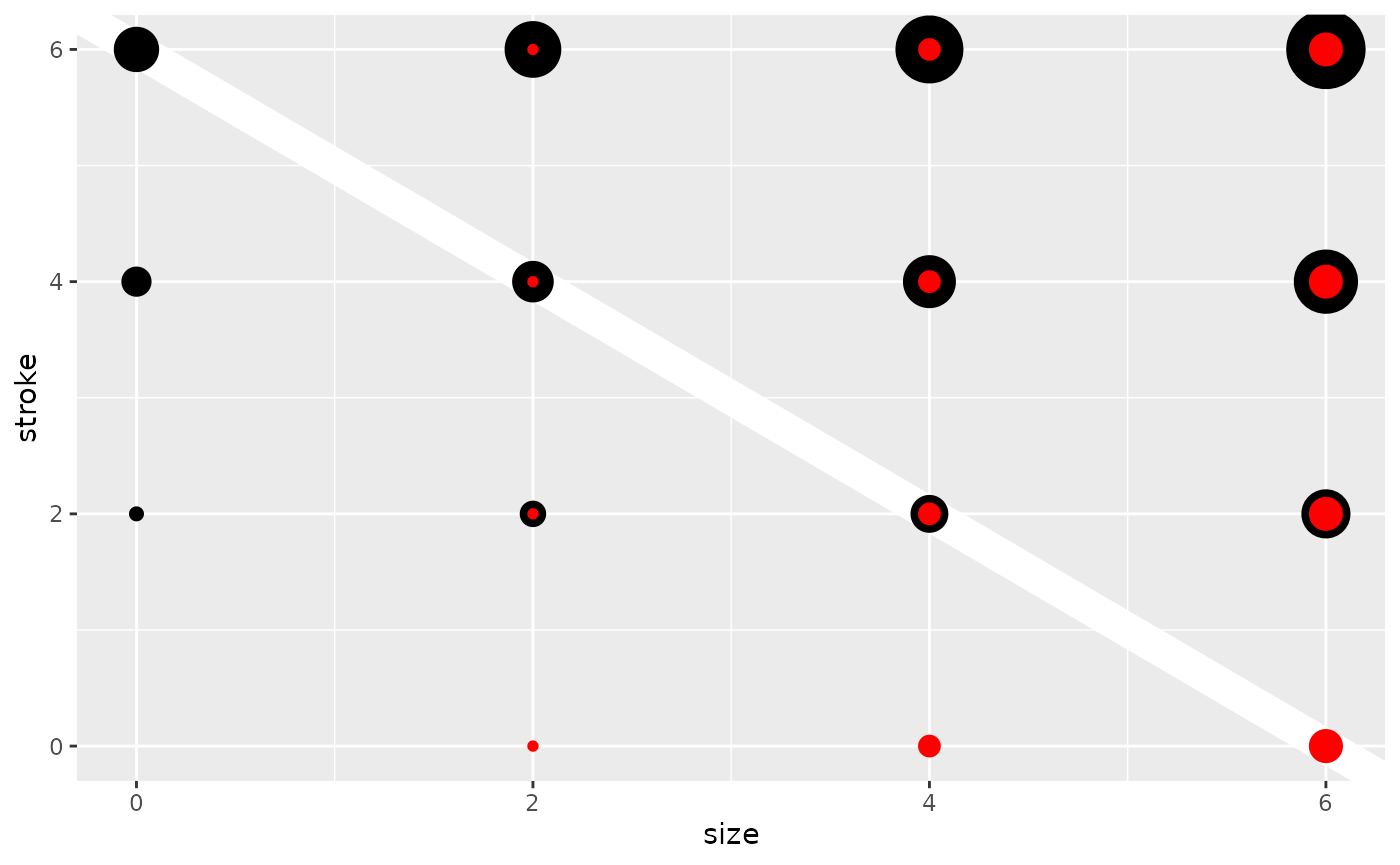
Because points are not typically filled, you may need to change some default settings when using these shapes and mapping fill. In particular, discrete fill guides will be drawn with an unfilled shape unless overridden (refer to geom_point() for an example of this).
Text
Font family
family sets the typeface of the font. There are only three values that are guaranteed to work everywhere: “sans” (the default), “serif”, or “mono”:
df <- data.frame(x = 1, y = 3:1, family = c("sans", "serif", "mono"))
ggplot(df, aes(x, y)) +
  geom_text(aes(label = family, family = family))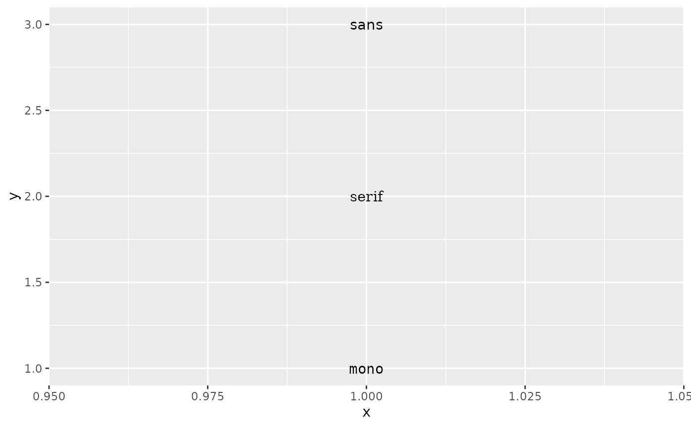
While these are guaranteed to work, they might map to different typefaces depending on the graphics device and operating system. Choosing any other value puts you at the mercy of the graphics device in use. We strongly recommend using a graphics device built with systemfonts support because this means that you can access all fonts installed on the operating system without any additional work. For now this means using ragg for raster output (PNG, JPEG, TIFF), and svglite for vector output (SVG). See the Fonts from other places section of the systemfonts vignette to learn how to make systemfonts aware of fonts not installed on the computer.
For now there is no PDF device with systemfonts support. If you need to create a PDF file using fonts other than the postscript fonts that pdf() natively support you can look into either of these packages:
showtextrenders text as polygons by hijacking the text rendering method of the graphics device.extrafontregisters system fonts in thepdf()device so it can natively find them.
Both approaches have pros and cons, so you will to need to try both of them and see which works best for your needs.
Font face
df <- data.frame(x = 1:4, fontface = c("plain", "bold", "italic", "bold.italic"))
ggplot(df, aes(1, x)) +
  geom_text(aes(label = fontface, fontface = fontface))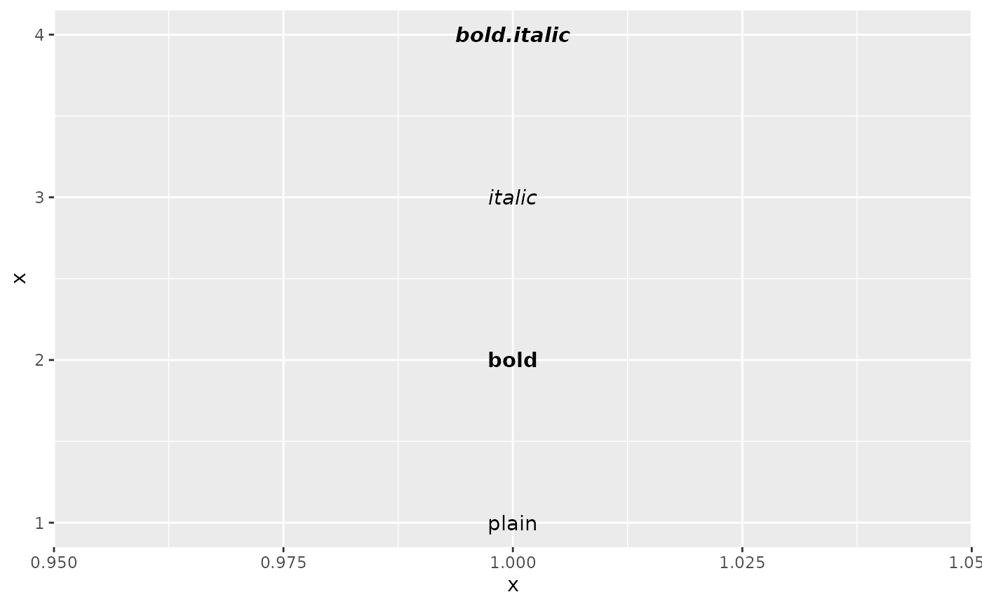
fontface/face is a catch-all argument that describes the style of the typeface to use. It can take one of 4 values: "plain" is an upright normal-weight font, "italic" is a slanted normal-weight font, "bold" is an upright bold-weight font, and "bold.italic" is a slanted bold-weight font.
The R graphics engine does not allow you to chose other combinations of styles such as other weights or specifying width. See the Extra font styles section of the systemfonts vignette for ways to circumvent this limitation.
Font size
The size of text is measured in mm by default. This is unusual, but makes the size of text consistent with the size of lines and points. Typically you specify font size using points (or pt for short), where 1 pt = 0.35mm. In geom_text() and geom_label(), you can set size.unit = "pt" to use points instead of millimeters. In addition, ggplot2 provides a conversion factor as the variable .pt, so if you want to draw 12pt text, you can also set size = 12 / .pt.
Justification
Horizontal and vertical justification have the same parameterisation, either a string (“top”, “middle”, “bottom”, “left”, “center”, “right”) or a number between 0 and 1:
- top = 1, middle = 0.5, bottom = 0
- left = 0, center = 0.5, right = 1
just <- expand.grid(hjust = c(0, 0.5, 1), vjust = c(0, 0.5, 1))
just$label <- paste0(just$hjust, ", ", just$vjust)

ggplot(just, aes(hjust, vjust)) +
  geom_point(colour = "grey70", size = 5) +
  geom_text(aes(label = label, hjust = hjust, vjust = vjust))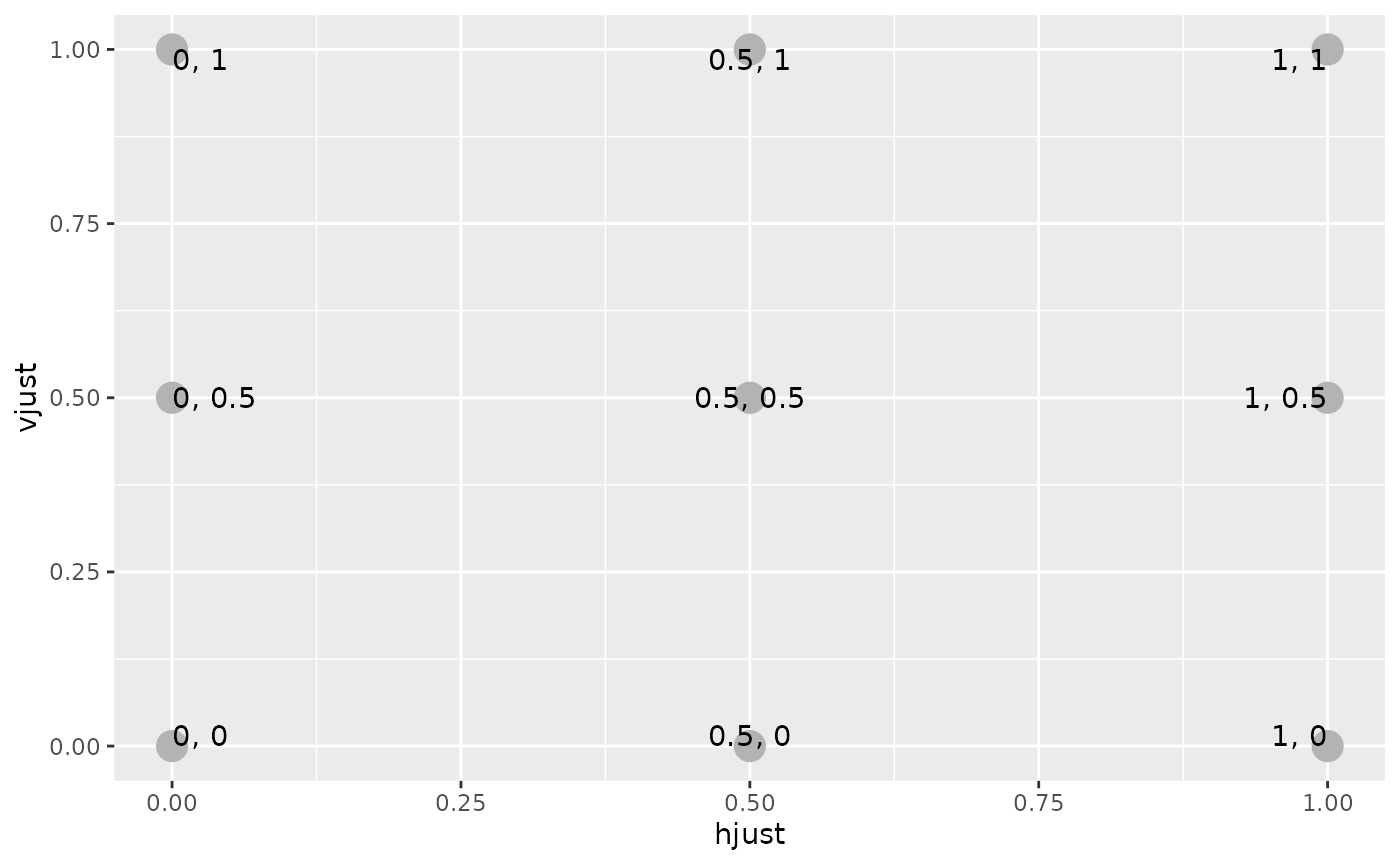
Note that you can use numbers outside the range (0, 1), but it’s not recommended.